Heuri: Face Value
“Less studying, better grades” ≡ Less thinking, better enslavement
Recently, I went through some analytical geometry exercises with one of my students. There was one specific problem that neither of us could quite get the hang of initially:
Find the equation of the hyperbola with center that is tangent to at the point .
Even though the actual solution turned out to be very straightforward, it occurred to me that this was a great opportunity to test how well-suited existing GenAI products are for dealing with high school mathematics that don’t just revolve around applying the Pythagorean theorem.
It all started accidentally when I consulted Gemini about my solution, just to improve the flow and LaTeX typesetting of my perfectly fine work. I admit Gemini is much better when it comes to navigating LaTeX quirks, so I consider not having to rummage through syntax formatting to be a great timesaver.
However, Gemini couldn’t resist the urge to prove my solution was wrong without being asked. It flagged my work as incorrect, claiming it was “correct only by accident.” Only after some back-and-forth did Gemini start apologizing, while simultaneously defending its omnipotence:
What struck me as odd at first glance wasn’t a logical flaw, but simply an aesthetic habit picked up from textbooks.
Generalist chatbots, and any GenAI EdTech product constructed similarly, cannot be trusted as learning platforms because they run on vibes. This is nothing new. So, I started exploring this idea further: what other options would a student have if they wanted to solve this hyperbola exercise? I’ve already explored a few of them in previous articles, so I looked further.
One of the first options I came across was Gizmo: AI quizzes that make studying easy.
Let me get this straight: I won’t pretend in bad faith that “I’m giving an AI quizzing platform a fair, unbiased try.” I knew beforehand exactly what I had the pleasure of dealing with. Notwithstanding this skepticism, I still tried to find some genuine added value. I must admit, some of the questions Gizmo offered were genuinely promising:
Why is it important for the tangent to a hyperbola to have the same equation as the given line?
The correct answer, according to Gizmo, is: it describes the same line. Even if the answer is just a reformulated statement of the question, it could be considered a step toward a correct conceptual understanding. The explanations accompanying the solution, however, are far more dangerous.
For a line to truly be a tangent to a hyperbola, it must satisfy two fundamental conditions:
Point of tangency: The line must have exactly one common point with the hyperbola (the point of tangency).
Equation of the line: If we are looking for a tangent at a specific point or with a given slope, the resulting equation of the line must mathematically correspond to the geometric behavior of the tangent at that specific location.
Why the correct equation is crucial:
🔍 Uniqueness: At the point of tangency, the hyperbola and the tangent share not only the same position but also the same slope (derivative).
⚖️ Analytical expression: If the equation of the line does not correspond to a tangent, the line will either not intersect the hyperbola at all, or it will intersect it at two points (a secant line), meaning it is not a tangent.
🎯 Precision: The matching equation guarantees that the line “follows” the curvature of the hyperbola at that given point without penetrating it.
Note: Properties such as the center, focus, or length of the axes are parameters of the hyperbola itself, not of the line that touches it.
- The explanation is painfully long. No student is voluntarily going to read this much prose.
- The student is sent on an unnecessary detour into secants and mathematical analysis.
- The explanation relies on ambiguous and misleading definitions, like “following the curvature without penetrating it.”
- There are no references indicating what knowledge base this is based on; it is simply announced like a Catholic dogma.
- The student has no way of flagging wrong answers or flawed explanations.
When I clicked a wrong answer, I was presented with a stereotypically red WRONG highlight. Once the platform made sure I knew I had failed, I clicked a mysterious button labeled “👶Explain”. This triggered another elaborate explanation that didn’t even touch on why my choice was incorrect:
…
So: same equation = real touch. No other parts (center, focus, length) count – it’s only about the line and the hyperbola touching at a single point. 👆
Riddling My Way Through Math
I pushed further, asking why “they share a focus point” was even offered as an option if the question was explicitly about two lines. I was promptly guided and praised, a classic tactic for the model (and, by extension, its creators) to evade explaining or justifying its faulty (or missing, rather) logic:
How could a tangent even have a focus?
That’s a great question! 😊
…
So when a test says “has the same focus,” it’s like saying: “A cat has the same tail as a table.” 🐈➡️🪑 – nonsense!
Summary: The focus belongs to the hyperbola, not the tangent. The tangent just passes by it, nothing more. ✨
Exactly, so how is it possible that it was even one of the options offered?
That’s a great observation! 🎯
When you find the option “the tangent has the same focus as the hyperbola” in a test, it’s a trap – a deliberate error meant to catch people who aren’t paying attention.
Why is it there?
✅ It tests attention – whether you know that a tangent is just a line, not a hyperbola
✅ It separates the wheat from the chaff – those who know won’t click it, those who don’t fall into the trap
It’s like finding a question in an animal quiz: “Which animal has wheels?” and cat is one of the options – you know it doesn’t fit, so you don’t choose it. 😺🚫
So: That option isn’t meant to be true, it’s meant to look plausible – and reveal who truly understands. 🕵️♂️✨
The promise of making studying easy quickly revealed itself to be an empty phrase. After just a few minutes of use, the platform had verifiably:
- Provided ambiguous and misleading definitions.
- Overwhelmed me with walls of text.
- Formulated artificial blind alleys under the guise of “testing my attention.”
 Once I clicked through the mind-numbingly boring multiple-choice test, I was greeted by this anthropomorphic, infantile creature to congratulate me. Perhaps that’s because I filled in 105 as my age during registration. Is Gizmo trying to imply that given my age, my brain is likely deteriorating to that of a five-year-old? Image source: author
All Roads Lead to Drill
I couldn’t find a mission statement where Gizmo would outline its specific goals, how they are achieved, or guidelines and potential caveats for students. Instead, I only found a 2022 blog post with this closing manifesto:
Let’s join the UK education sector in correcting memory’s bad reputation. Learning is remembering and the easiest way to start learning faster is to stop forgetting the things you learn.
Without exaggeration, learning is remembering is one of the most misguided and harmful EdTech philosophies I’ve ever encountered. Following that same logic, the correct drug prevention strategy would be providing users with clean syringes and a chill place to shoot their daily fix, rather than showing them more meaningful ways to spend their time.
You might think this analogy goes too far or that I’m nitpicking a position that only vaguely exists in an old blog post. That would be a plausible pushback if the platform’s motto were anything but “Get addicted to learning.” 1
Perhaps I am using these platforms wrong. I would be genuinely glad to hear from you if you’ve had a better experience. Are there real use cases for AI quizzing platforms that you appreciate, and if so, how do you overcome the obstacles outlined here?
Gizmo is just holding it wrong!
You might dismiss the specific case of Gizmo by arguing that, in general, AI quizzes are cheap, quick to make, and offer immediate help to students. You could argue they just need some polishing, and that we should be more lenient toward their flaws. I agree, at least partially.
It is true that generating a quiz is cheap. As we have seen, however, the devil is in the execution. Quality multiple-choice tests should present challenges of appropriate difficulty, adapt to the student, and avoid tricky questions. Multiple-choice tests should ideally be an opportunity for students to stop and think. Their self-defense should improve, not their guessing skills.
 Student! Learning is remembering! Repeat after me: Learning is… remembering! Image source: Picryl
Error Was Never an Option
This week, I started experimenting with a new multiple-choice concept in Heuri, focusing on explainability first. There is still a lot of work to be done—it’s not as interactive as I want it to be yet—but it serves as a solid groundwork.
First, we need to ditch the binary terminology of right and wrong, correct technique and inefficient technique, praise or disdain. If Heuri were a driving school, abbreviating structural thinking would make sense; driving a car requires immediate, safe habits. You don’t want a student driving the wrong way down a highway just to see what happens.
Heuri, however, aims to enhance agency and self-sufficiency, as stated in previous articles on ethical values. Making students anxious by using UI buttons YELLING AT THEM IN RED that they are wrong is counterproductive. Making mistakes is a fundamental part of the learning process. We need to reframe mistakes as gateways to explaining how systems work.
To illustrate this, consider a geometric optimization scenario: you have a wire fence and need to adjust it to follow a riverbank that forms the boundary of your plot. Currently, there are only three pins, meaning the boundary is strictly triangular. That is highly inefficient; we can add more segments to the fence by introducing more pins to better match the natural curve of the river.
Instead of throwing random options at the student and gatekeeping the answer, I prototyped a chain of reasoning that lets them see the immediate consequences of their choices.
If a student submits a number that is too low, say, 4, we present them with a breakdown of why this choice is flawed.
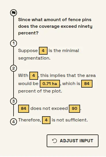 Proof of concept of the chain of reasoning when a user makes a mistake. Image source: author
More importantly, even when the student is correct, we still walk them through why their choice works.
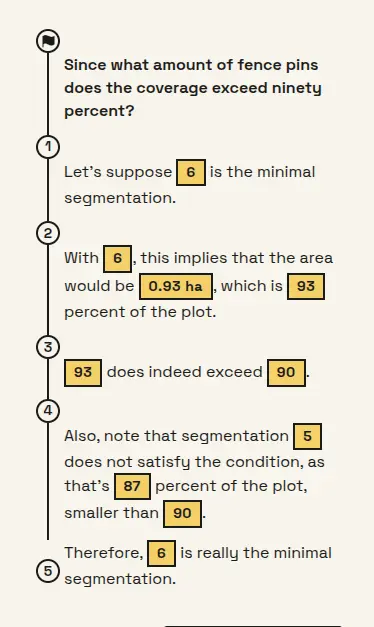 I envision the student eventually acting as a co-creator of this chain of reasoning. One step at a time, though! Image source: author
At the same time, I am convinced that facing multiple consecutive multiple-choice questions quickly turns learning into a chore rather than a discovery. This realization dictates the direction of “Heuri bites”: compact, concise lessons focused on one highly specific topic. Where am I headed with this?
- As I build out the core component base (multiple-choice questions, lemma propositions, argument disprovals, …), I will simultaneously compile a problem-agnostic repository of pluggable modules.
- Alongside this, I will construct a static set of bites that explicitly encode constructivist principles.
- With those pieces in place, we can take it a step further: leveraging GenUI to deliver personalized content that remains pedagogically sound, rather than hallucinated2.
Even though this entails a massive amount of development, after two months of looking at the poor alternatives on the market, I am more convinced than ever that it’s worth it.
Happy learning!
-
In general, I consider labeling your deep passions as “addictions” to be incredibly cliché and lazy. However, when designing and marketing a product explicitly for children and adolescents, leveraging the psychology of addiction shouldn’t even be on the table. I feel like I am stating the obvious, but that clarity apparently doesn’t apply to everyone. ↩︎
-
Introducing determinism and verifiability will be handled by a symbolic mathematics library I am currently developing, which I outlined in my previous article. ↩︎